Work/U of T Clubhouse
U of T Innovation Hub · Clubhouse · 2022
From 1,000 clubs
to the right one.
U of T has over 1,000 student clubs across three campuses, and the information is scattered and out of date. We designed Clubhouse so students can find a club that fits, and build real skills there.
11%of students we surveyed were
satisfied with their clubs
Problem
With over 1,000 clubs and outdated information, students join clubs that don’t meet their expectations, and miss chances to build the professional skills they joined for.
Solution
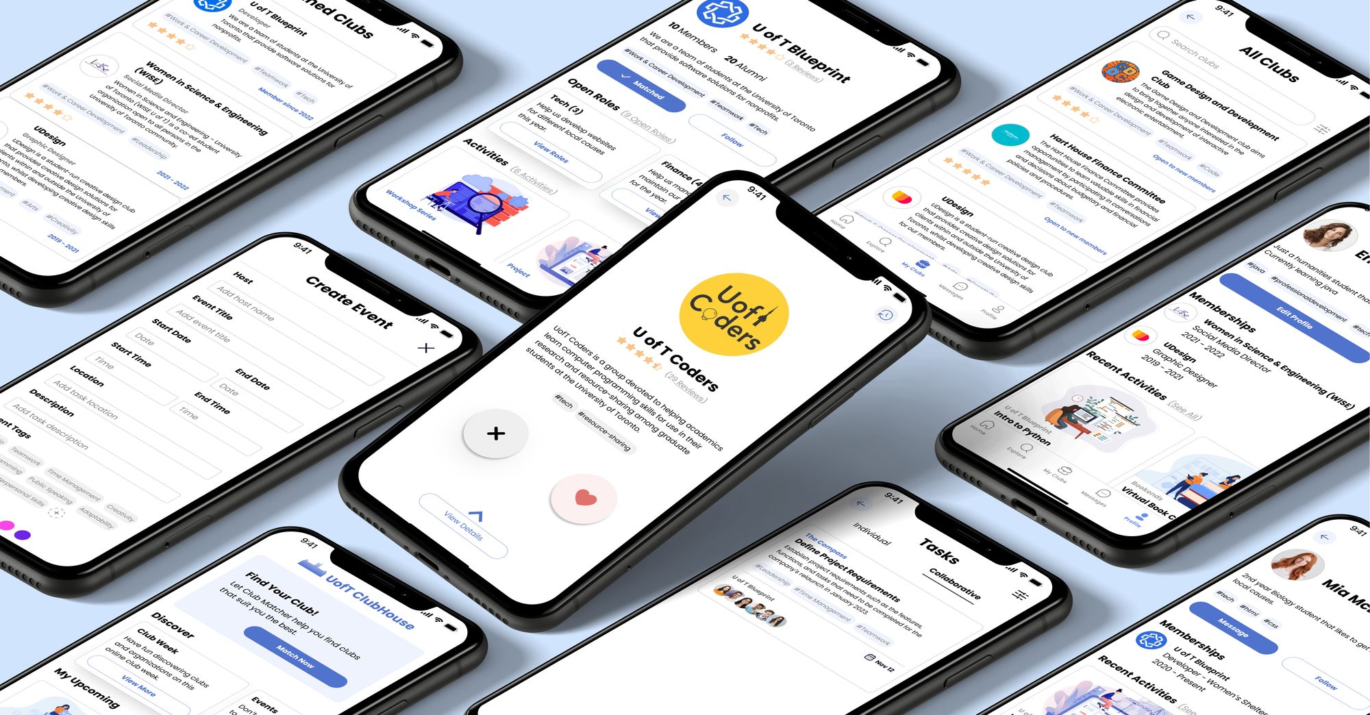
Clubhouse, a mobile app with a Club Matcher, club profiles with open roles, reviews and member messaging, and a task journal that records the skills students gain.
My role
Product and visual design in a team of three for the U of T Innovation Hub: research with the team, ideation, low- to high-fidelity prototypes and usability testing.
- Team
- Emily Rose (UXR), Sabrina Ma (UXD) and me
- Client
- Innovation Hub, University of Toronto
- Timeline
- May – Aug 2022
- Outcome
- High-fidelity prototype
01The moment
It’s September. A third-year student wants experience outside the classroom, and opens a list of more than a thousand clubs.
“Which one is for me?”
Co-op and internship opportunities are limited and depend on your program, so students lean on clubs to build transferable skills. But what they need to know lives in word of mouth, club fairs and outdated pages.
Clubs matter more than they look
Our secondary research showed students join clubs for three reasons: to meet peers with shared interests, to build professional skills beyond academics, and to relieve the stress of school.
02What we heard
36 survey responses and 5 interviews pointed the same way
- Only 11% are satisfied with their club involvement. Most students aren’t getting what they hoped for.Questionnaire · n = 36
- 50% have left a club that didn’t match their interests. Information up front could have prevented it.Questionnaire · n = 36
- 67% join to develop professional skills. “It looks good on applications, whether you’re applying for funding, an academic position, or an on-campus job.”Questionnaire · interviews
- Miss the start of term, miss your chance. If you don’t engage during registration, many clubs won’t let you join later in the year.Interviews · n = 5
So the question became
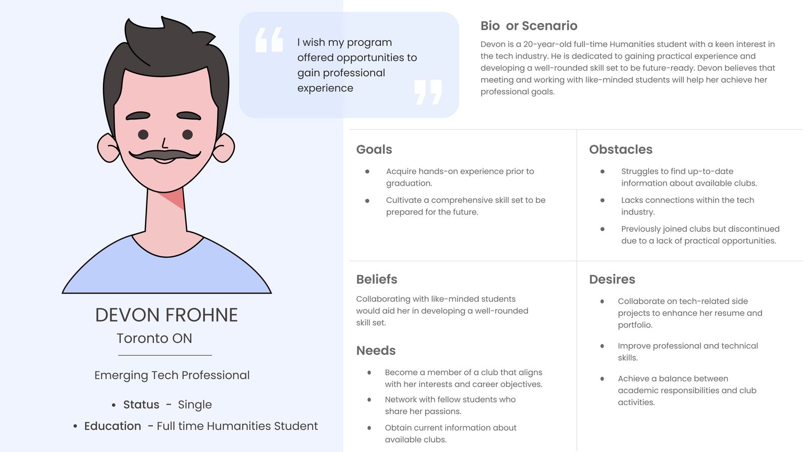
How can we help students like Devon find clubs that build the professional skills they need for the future?
- Discover clubs that match their interests and expectations.
- Stay connected with members, even after the term ends.
- Gain practical experience for life after graduation.
03The obstacle
Too many clubs called for fewer features, not more
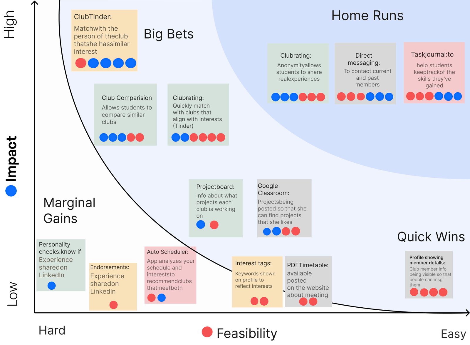
Our brainstorm produced far more ideas than one app could hold. We voted on each one’s impact and feasibility, then used a prioritization grid to keep only five: matching, club ratings and project boards, up-to-date club info, member messaging and a task journal.
The turning point
We made discovery feel like a game. Instead of another directory, we built a Club Matcher. In lean evaluations with four students, they said matching “adds an element of enjoyment and engagement”, and it became the heart of the app.
04The redesign
Three changes from the lean evaluation
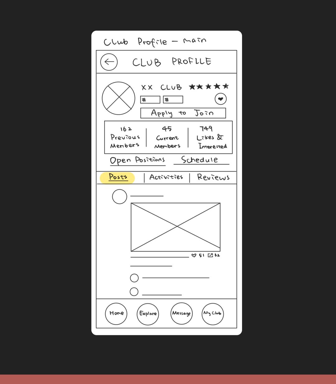
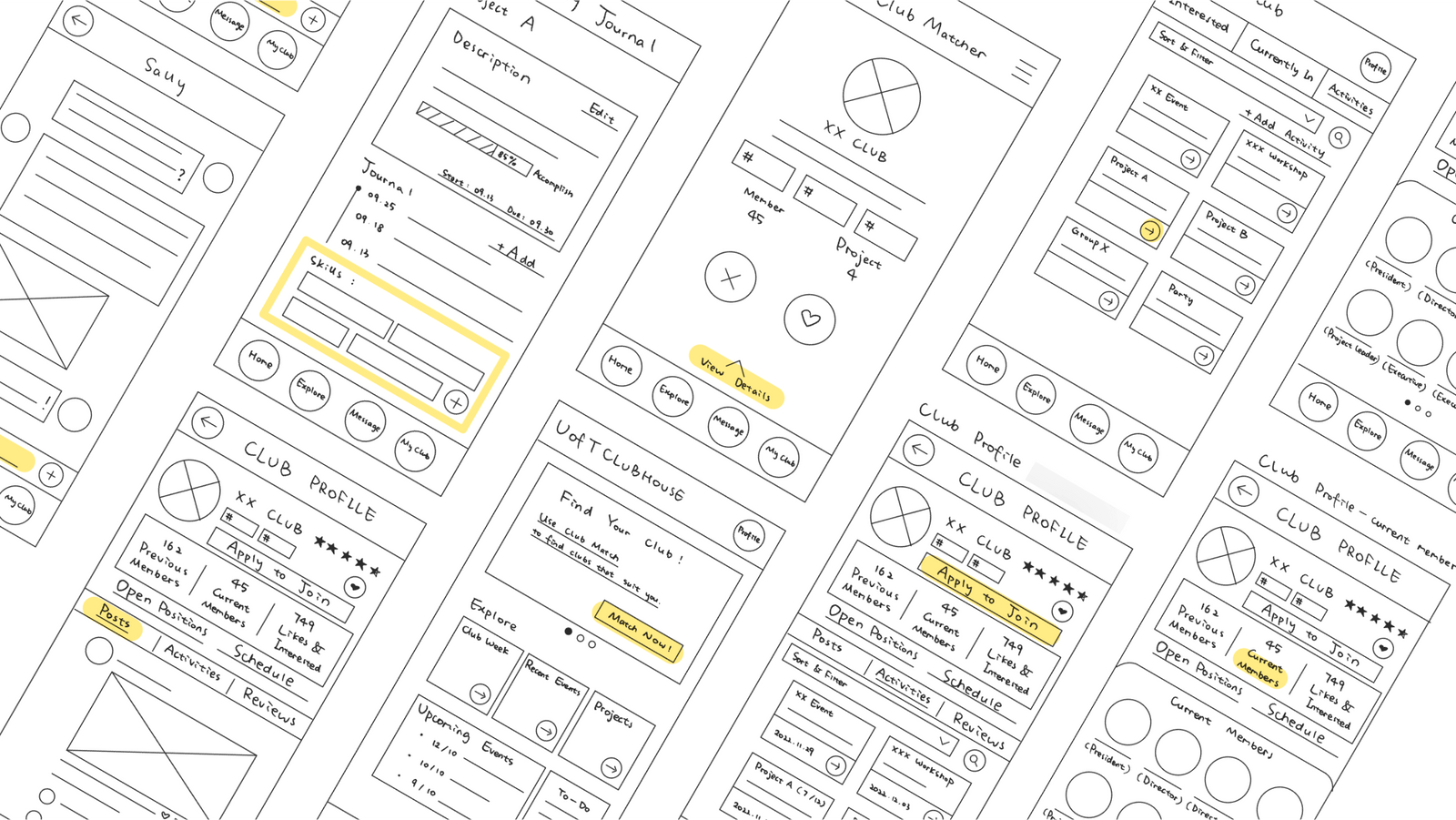
We tested low-fidelity sketches of three flows (match, explore, track) with four U of T students, then rebuilt the screens in medium fidelity. Flip between before and after.
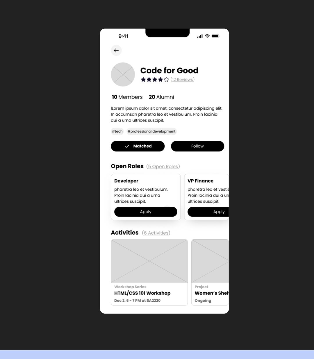
A club profile you can actually read
Too much information at the top. Participants were unsure where to click, and couldn’t recall the screen afterwards.
Fewer buttons up top, with actions spread through the page where they’re needed.
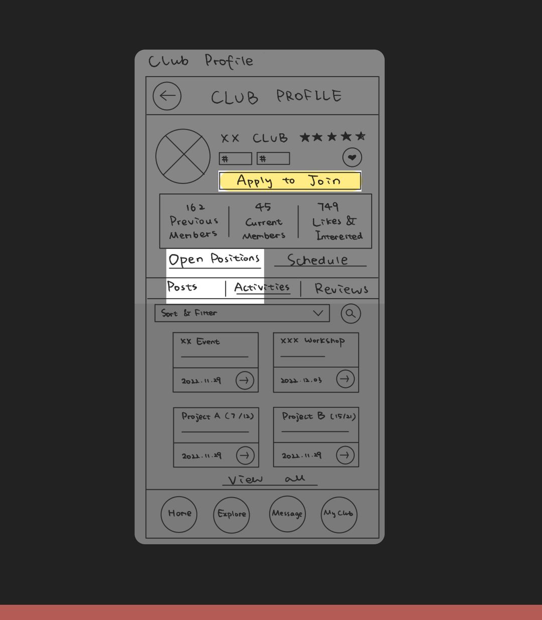
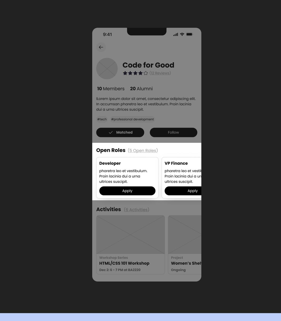
One clear way to join
“Apply to Join” and “Open Positions” competed, so joining a club was unclear.
The top button is gone. Each open role has its own “Apply” button.
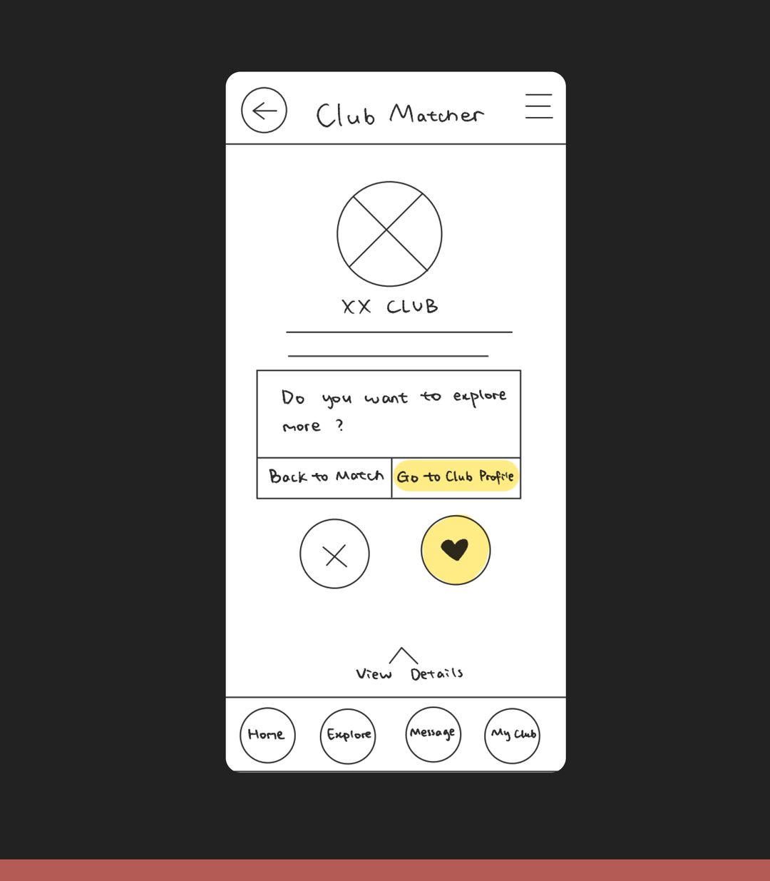
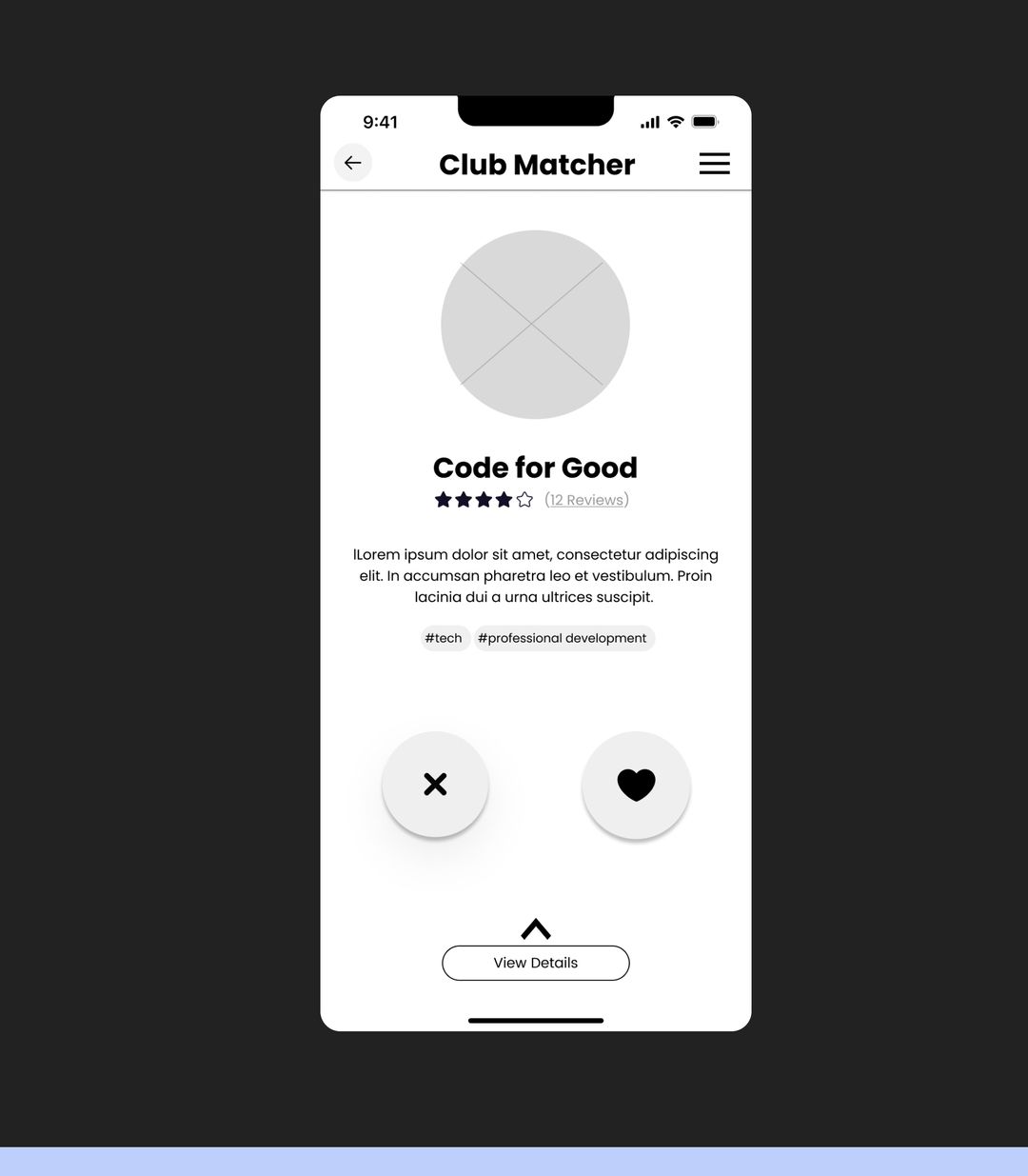
Matching, uninterrupted
A pop-up appeared mid-matching, and participants found it frustrating.
No pop-up, so students can keep matching without breaking their flow.
05Proof
Four usability tests on the medium-fidelity flows
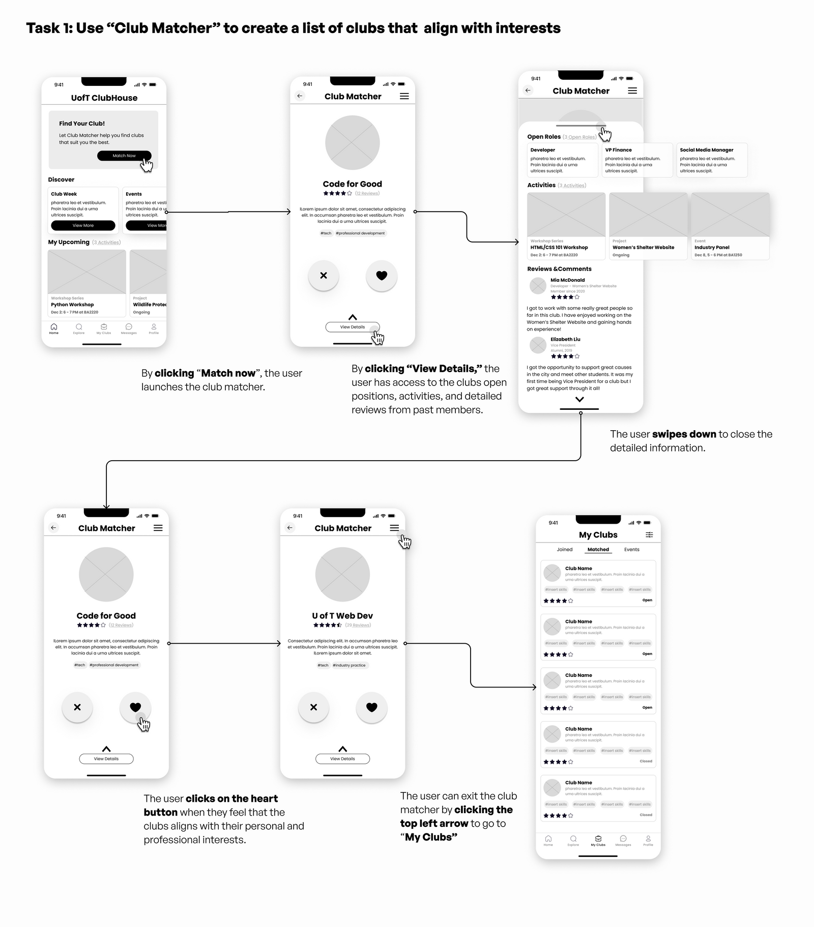
What worked. The home page was clear and made the matcher easy to find. Club Matcher made searching fun and intuitive. “My Clubs” put past and current projects, matches and events in one place.
What we fixed next. The home page had no call to action for the task journal, there was no way to see match history, and it wasn’t clear which part of “My Clubs” held the journal.
06In their hands
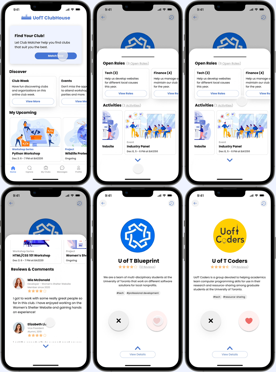
The three moments that matter
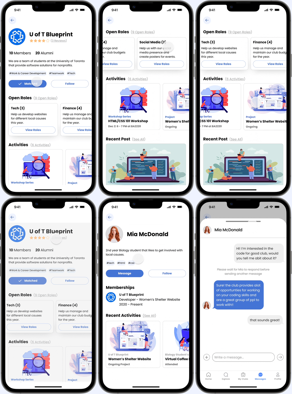
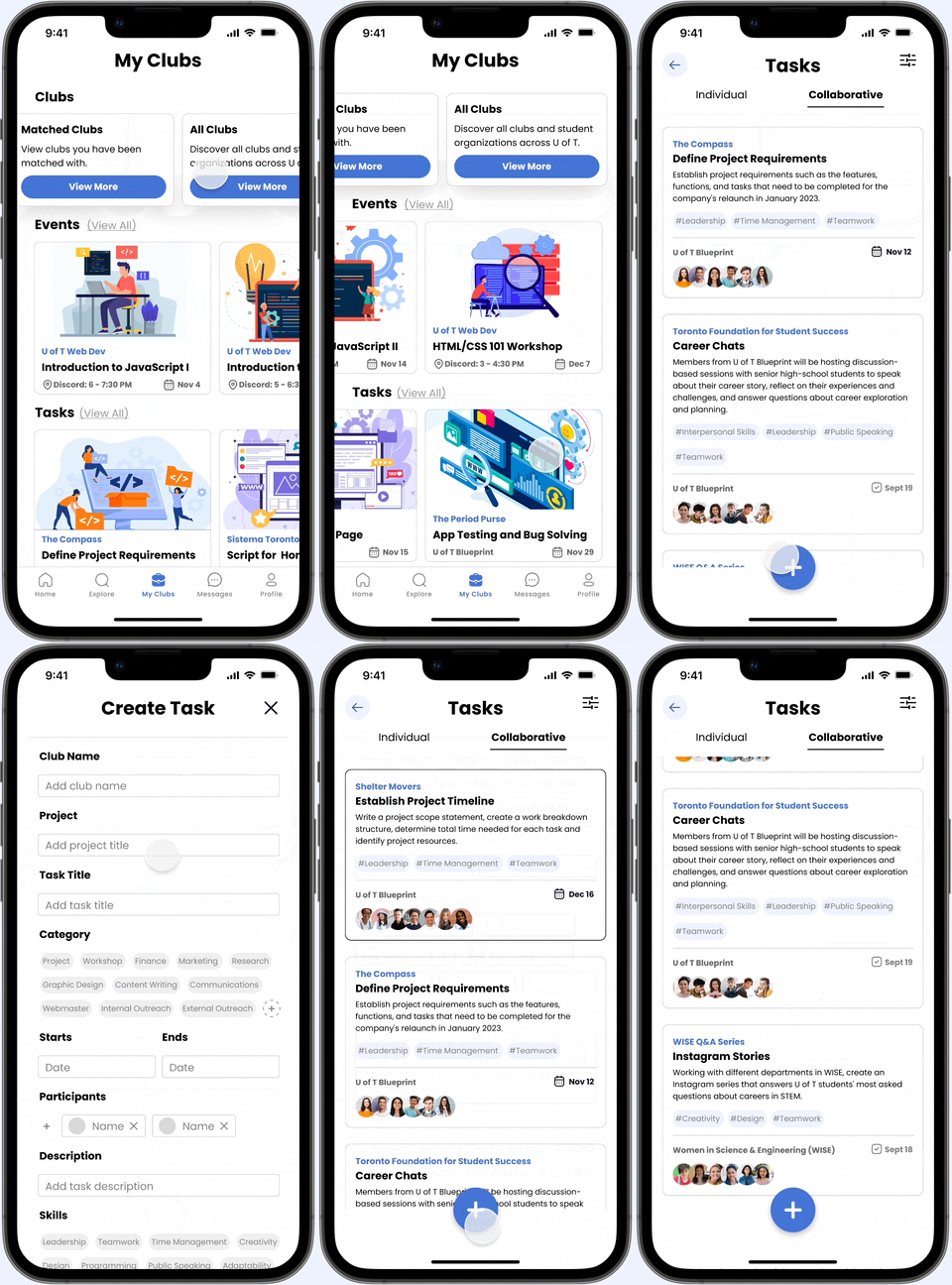
The high-fidelity prototype: find a club, get to know it, and keep track of what you learn.
07The new reality
3core flows, prototyped in high fidelity for the U of T Innovation Hub: match, explore, track.
- 36
- questionnaire responses and 5 interviews behind every decision
- 4
- usability tests on the medium-fidelity prototype
Clubhouse gives U of T students one place to find the right club, see what it expects, and show the skills they built there.
08What I took away
- Storytelling makes better experiences. Twice-weekly presentations taught me that a clear story helps people understand and empathize with users’ problems.
- Don’t fall for the first solution. Iterating past it is where the design got good.
- Sketch the odd ideas too. The unusual ones sometimes spark the breakthrough.